In Cody Townsend’s new video series ‘THE FIFTY’, he aims to spend the next 3 years tackling every single line from the quintessential book, ‘Fifty Classic Descents of North America’, compiled by Chris Davenport, Penn Newhard and Art Burrows.
In Cody’s words: “All of them have at least one historical descent, but one person has not skied them all. Over the course of the next three years, I will attempt to ski every line as told in the book and will document the adventure, the challenge and the fun in the web series,”
I was happy to work closely with Cody to develop and illustrate this identity for his impressive personal project. I created the final piece old school style on the light box, drawing the title and the peaks and then using 4 more separate sheets of paper for the 3 layers of highlights and shadows. You can follow along on Cody’s adventure on Instagram and YouTube.
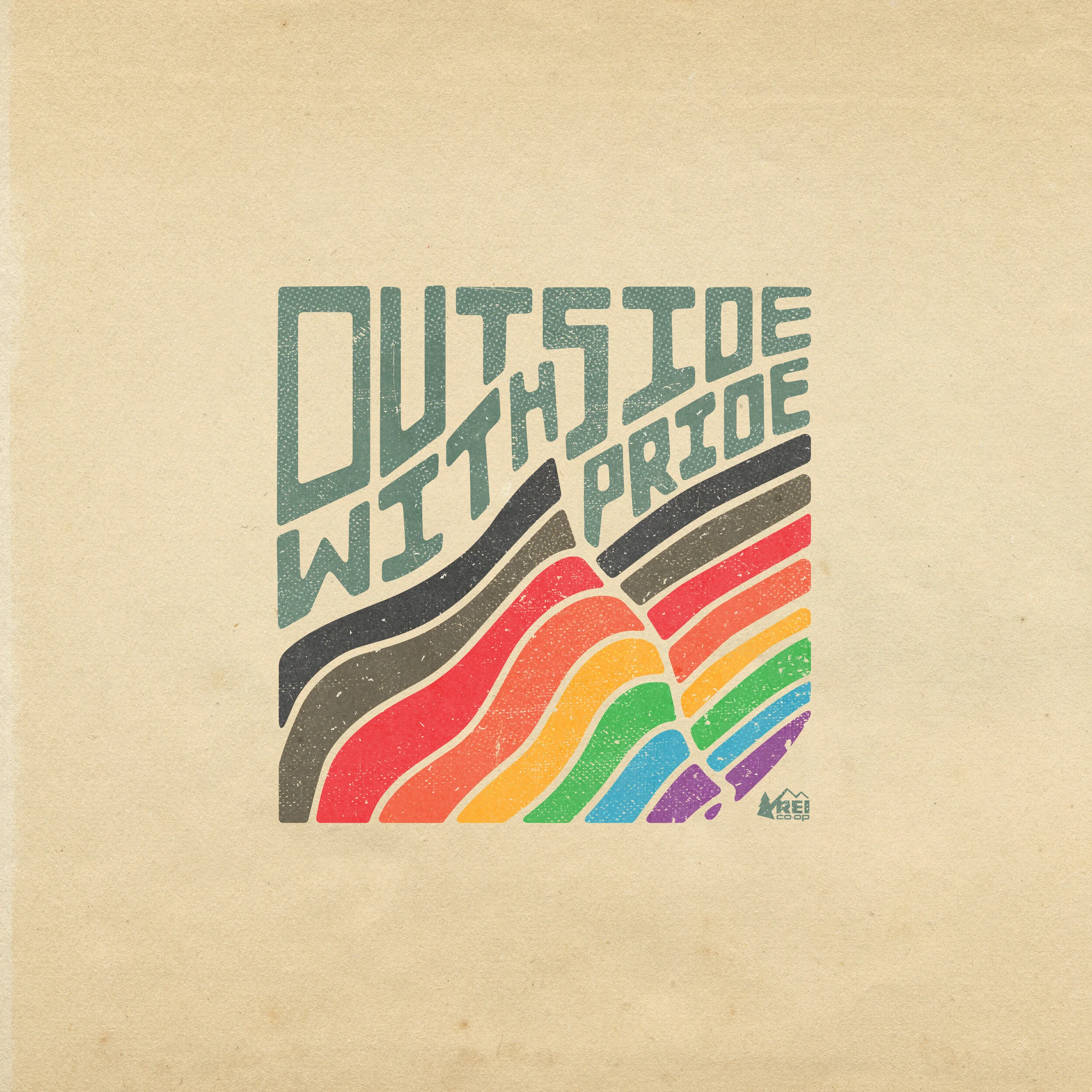
A collection of logos and illustrations developed for various REI CO-OP products.
Concept work for Adidas Football US. As a Packer fan from Wisconsin, it was a treat to work on some illustrations of Aaron Rodgers to promote their ‘FREAK’ line of cleats. Big thanks to Paul Yih for the Creative Direction on this one.
HEST is the brainchild of my good friend and former K2 alumni Aaron Ambuske. He set out to design the best sleep system for car camping and he did it. I worked with him to design this unique illustration for the launch of their new pillow. Check out what they are up to at HEST.
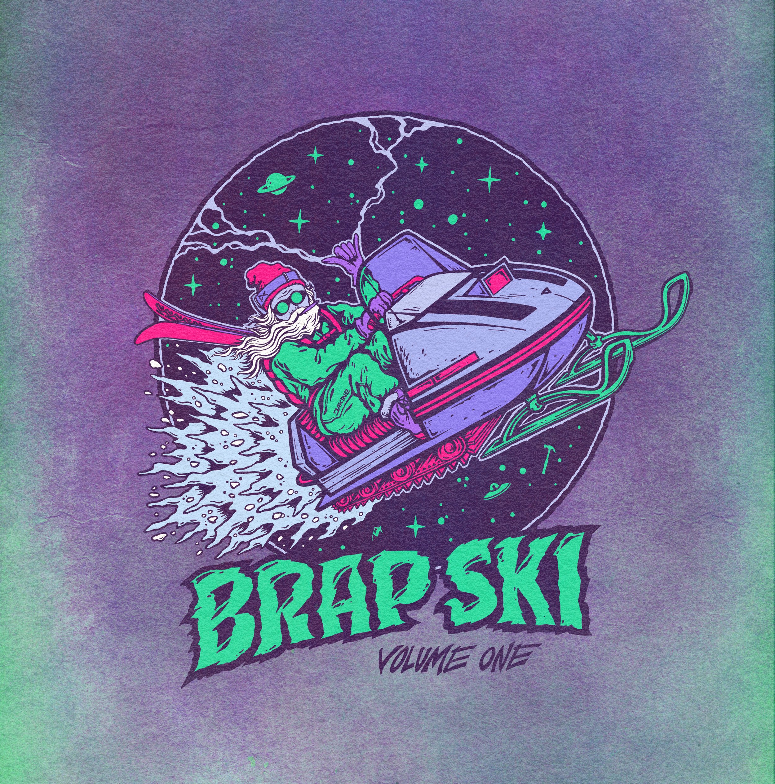
Proud to unveil my third collaboration with JSKIS. The ‘Nocturnal Daydream’ is a brand new 106mm chassis ready for anything. Had a ton of fun inking this one up! It just dropped in September and is almost sold out already!
From JSKIS founder, the legendary Jason Levinthal:
“I'm super stoked to be collaborating with Ryan Schmies on another sick & twisted (soon to be legendary) ski graphic! Ryan is from another dimension and occasionally travels back in time to our parallel universe to share images from a world we would never otherwise see. These sketches of the actual animals from Ryan's home dimension truly defy all physics of the space-time continuum in a way that even NASA has yet to understand.”
————————————————————————
Grab some new skis over at JSKIS
Sean Pettit's sophomore Pro Model ski from K2. Another fun collaboration with Sean to make his dream ski come to life. We set forth on the cobra as a continuation of the 'predator' animals theme. After illustrating the snake, I worked closely with the darkroom magicians to develop a few custom inks for this ski to really make it shine. Devil is in the details.
A few logos created for REI and their Co-op Cycles. The ‘Peace Tree’ logo was made in conjunction with their foray into mountain bikes and the ‘Wavy’ logo was created for general use. The ‘Test Team’ badge was a little nod to the old days of grabbing your Dad’s motorcycle helmet and being the guinea pig off a sketchy jump.
60 plus pages of all things Snowbird. I worked closely with Director of Marketing, the Assistant Director of Marketing, and writer/editor Julia Partain to design and build out the latest magazine version for the storied Utah resort.
-MORE TO COME-
My second Artist Collaboration with JSKIS. So satisfied with the end result of this project. This model quickly sold out after it’s initial launch and ended up being one of J’s fastest selling skis. Keep your eyes peeled in the future for more J x SCHMIES:)
A sampling of ELAN logos created for the legacy ski builder from Slovenia.
Coming soon:)
I worked closely with Jasper Newton Media to create the overall identity and titles for his new short film ‘Stray Dogs’, featuring the skiing of Karl Fostvedt and Lucas Wachs. Scroll to the bottom to watch the full feature.
I had the opportunity to create some new graphics for the infamous LINE Skis. I worked with their Brand Director to craft a new look for their award-winning Sick Day freeride collection, spanning 4 models of various waist widths. Available now at finer retailers worldwide.
Seth Morrison Pro Model created in the style of the native Northwest Coast tribes. Seth was spending quality time in BC and Alaska and desired an evil take on the artwork he loved seeing on his travels.
The pattern is top printed as a black matte on gloss, giving the ski a decidedly unique look. 'Visible' branding was limited to the custom acid etched and engraved logo tip plates I designed. These plates actually contained a removable rivet, exposing the hole for climbing skin attachment.
One of my all time favorites to work on and ski. Good thing I stockpiled a few pair.
Swiftwater Films is a new full-service production company rooted in environmental ethics and specializing in visual storytelling that inspires, activates, and engages.
I worked closely with my friend Shane Anderson to bring this identity to life. Looking forward to seeing Shane and the crew at Swiftwater Films create some amazing content and galvanize further positive action in preserving our outdoor spaces.
I recently had the honor to work with the legendary North Cascade Heli to redesign their identity in commemoration of their 30th anniversary season. In celebration of this milestone, they partnered up with Old Schoolhouse Brewery to make ‘Rotor Wash IPA’.
As Washington state’s ONLY Heli operation, they explore and ski the jagged peaks of the majestic North Cascades. Life is short, so go book a trip today to the beautiful Methow Valley and visit the good people at North Cascade Heli and Old Schoolhouse Brewery!
Illustration for personal branding.
I worked closely with ReachNow’s Brand Director to develop this aesthetic for their Summer 18 campaign ‘Wild Within Reach’.
ReachNow has stocked all of their BMW 3 Series and X1 vehicles in both Seattle and Portland with state park passes, allowing users in both cities to experience the nearby outdoor amenities at no additional charge. ReachNow has also pledged $25,000.00 to conservation efforts supporting Oregon and Washington State Parks.
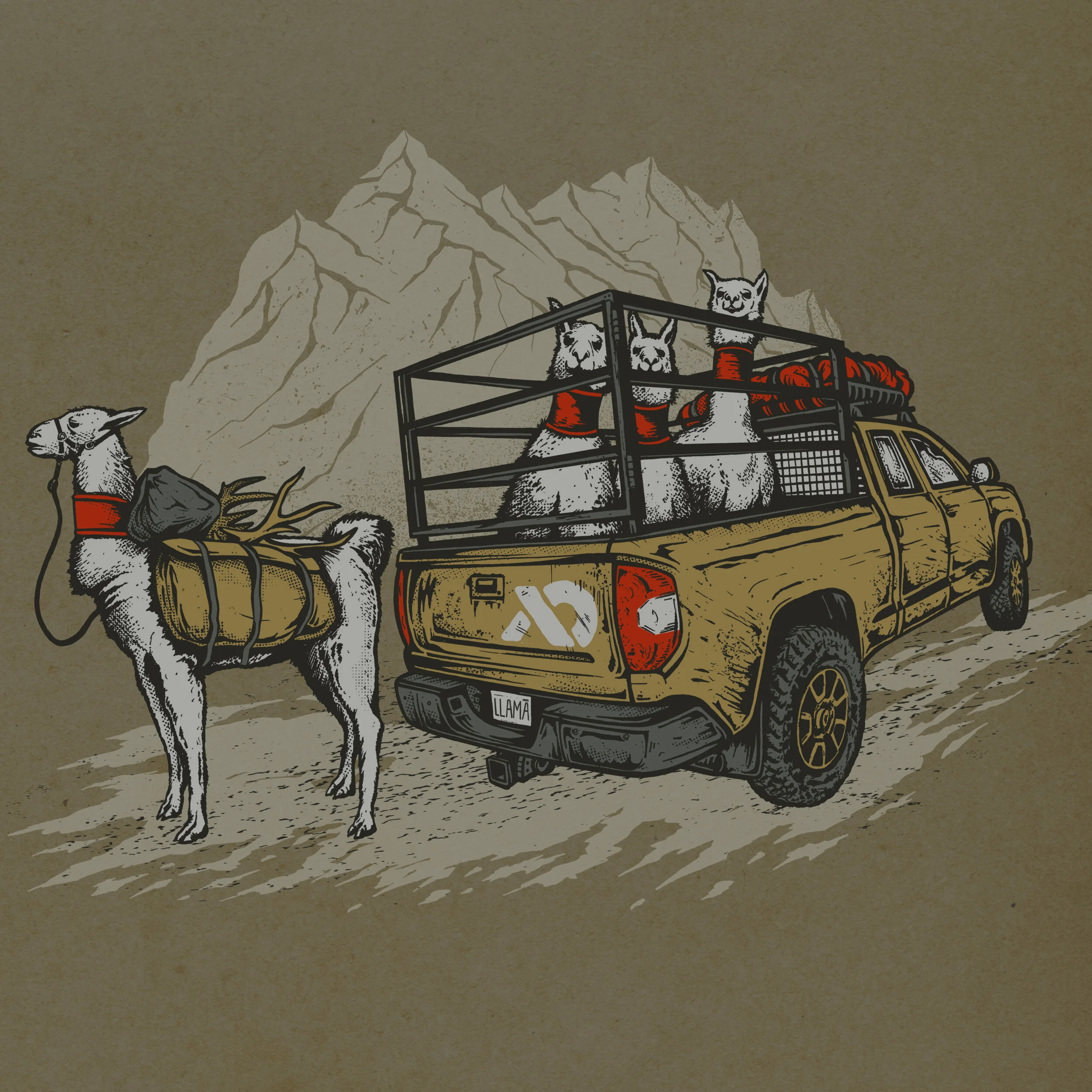
‘The Hunt Rig’ for First Lite, based out of beautiful Ketchum, ID. This design immortalizes the unique step of their friend from Bell Ranch Pack Llamas. Always great to work with the crew at First Lite!
I had the pleasure of working with Wilde & Co, illustrating a small barrel which was incorporated into the identity and and packaging for 10 Barrel Brewing. Initially a small batch start-up brewing operation based in Bend, OR, 10 Barrell grew in size and popularity and was eventually purchased by Anheuser Busch. With an influx of capital and distribution, they’ve grown and spread their wings across America, but they’ve maintained their craft approach and still live their mantra of ‘Brew Beer, Drink Beer, Have Fun Doing It.’
A piece from a collection of graphic illustrations created for Los Angeles, CA based design lab, Matiere.
I’m excited to collaborate with ski industry pioneer Jason Levinthal to create the Cascade, a set of limited edition JSKIS. Jason has done more than his share to facilitate skiing’s progression and growth by founding LINE skis and launching Full Tilt Boots. Now fully independent with his brainchild JSKIS, he works with various artists, crafting limited numbers of high quality ski product built in North America. These sticks are available now at JSKIS.COM
From Levinthal:
“I've waited over 15 years to work with Ryan Schmies on a ski graphic. He was in college when he created K2's legendary "Public Enemy" ski graphic. It caught the ski industry off guard, a first hand-drawn urban scene with artwork covering the ski tip to tail and edge to edge. Shortly after, the rest of the industry raced to catch up. Now that he and I are independent, it only took a phone call and here you have it!
Ryan grew up skiing a small hill called Cascade in Wisconsin and today he lives in Washington state skiing the Cascade Range, so the name for this graphic came easy. He used good ol fashioned pencils, ink from an assortment of his prefered cheap pens and had 'Ride the Lightning' on repeat to create this masterpiece.”
I worked with the crew at Mystery Made to dial in this new graphic for the Hyperlite Wishbone, a high-end cable specific deck for their 2018 collection.
A random buckshot of some ads I created through the years for K2 SKIS.
Currently digging through the 15 years of K2 SKIS advertising archives.
MORE TO COME at a later date.
I worked in conjunction with the VP of Global Product and Marketing to brand specific product segmentations of ELAN’s ski collection. The Amphibo collection is All-Mountain Piste, the Ripstick is Freeride, and the Wingman is All-Mountain Versatile offering.
Over the course of a few years, I had to opportunity to create 2 limited edition K2 Iron Maiden skis. Being a long time fan, this was a treat.
The Trooper art is absolute iconic imagery from Maiden's 'Piece of Mind' album. We didn't want to just reproduce the existing art onto a ski, so I took the opportunity to illustrate Eddie, giving this classic image a modified look. The final result was a band, team and consumer favorite.
The year before we created our first ski using the artwork from the Killers album. We utilized a 4 color print for the top but I needed to create a base of the same design. Base die-cuts are basically a giant puzzle of interlocking colors of P-Tex base material. You need to be cognizant of cut angle, the size of the pieces, etc. I'm more than satisfied with the end result and I'm pretty sure I pissed off both the factory and the process group with the base complexity.
I created a custom graphic with Red Mountain B.C. for their innovative ‘Fight the Man. Own the Mountain’ crowdfunding ownership campaign. In conjunction with their product partners, Mervin Manufacturing and Blizzard Skis, 2 unique pieces were created that were available exclusively for investors. This artwork showcases the unique phenomenon known as the Kootenay Sea. Red Mountain remains one of my favorite places to ski, so it was certainly an honor to be involved in this project.
This was the 5th iteration of the infamous K2 HellBent. For year 5, I went with a little bit of Wisconsin meets Deliverance. Hillbilly flesh harvesters all done up in a palette of bright blaze orange. This one got some looks on the mountain and well.....everywhere else. I can't even recall the amount of hate mail this generated from angry parents. In the end, it sold out and remains a personal favorite.
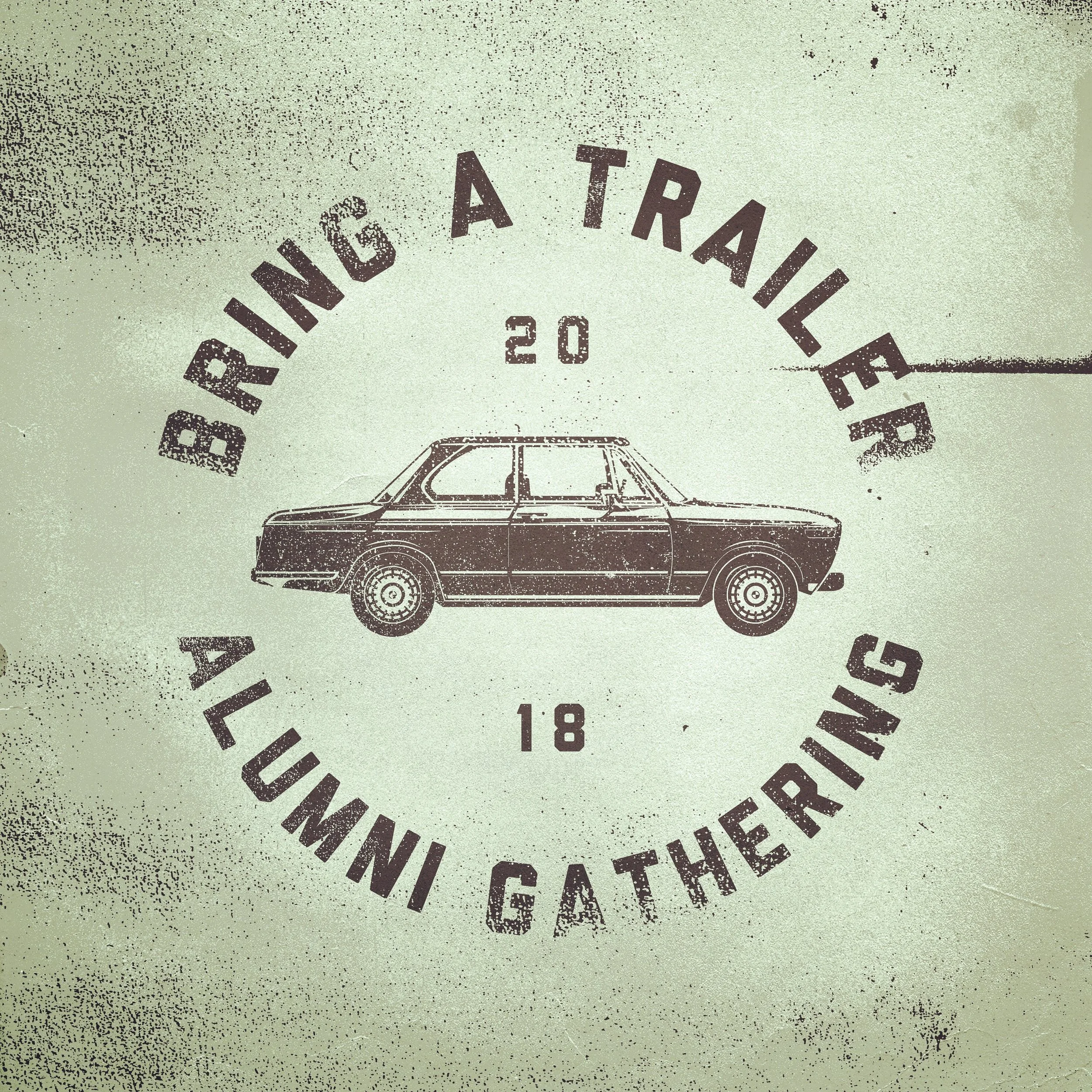
San Francisco based ‘Bring a Trailer’ is a online classic and vintage auto marketplace. If you want it, they probably have it listed. Go find your dream ride today!
All-Mountain ski boots designed for K2 SKIS from too many concepts to spec-sheet hell to production buyoff. I also spent a fair bit of time in photoshop post production to make them look real good. It is often overlooked to make product look premium post photoshoot, but it is one of the most important steps before creating press kits and image galleries available for distributors and dealers.
SMITH Optics I/O7 goggle for the one and only Bobby Brown. This is offered as part of their limited edition Athlete Collection. I have always been a fan of Bobby's ability to blend technicality with style and it was fun to bring his goggle idea to life.
Available now.
Worked with the good folks over at the infamous and hilarious Butt Snorkeler to develop a tee and hat design for their Summer ‘18 collection based on a throwback style postcard.
This was the global marketing campaign identity I created for K2. Each year we set forth to have a damn good time executing a thematic direction away from what the rest of the industry was doing. As you can see, we decided to became a motorcycle gang. Badass leather jackets with the ensemble shown here were standard issue and we even had the crew over at Orange County Choppers build us a custom K2 motorcycle.
The new Athlete Collection Squad XL goggle for pro skier Cody Townsend.
“Being from California doesn’t just mean I was born there. I’ve realized the people, culture, mountains, coast and valleys are part of my DNA. So for my Smith ID, I wanted to put a little bit of that DNA in the design. The California Bear and Red Star in the goggle are obvious tributes to the state flag. The leather triangle patch is a subtle acknowledgment of the sawtoothed peaks of the Sierra Nevada, where I was born and found interest in skiing, climbing and hiking. Lastly, the colors black and tan combine to highlight the diversity I grew up with and the earth tones of the California woodlands, deserts and beaches.” -Cody Townsend
I created a couple of limited edition Cal-themed graphics for the one and only Marshawn Lynch and his Bestmode brand. This project commemorated the 10th anniversary of Lynch 'borrowing' an injury cart after a Cal Football win over the Washington Huskies.
I developed this graphic identity and subsequent collateral around the idea that these skis were going to be a radical departure from where K2 had been. This was a brand new collection built from the ground up. New tech, new progressive shapes and a new personality. I opted for clean and speak simplicity to showcase the new construction techniques. The composite core, wood core and metal titianal are all visible through custom transparent pearled inks. The traditionally large visible tip branding is kept nearly tonal for a fresh look and the only visible hits from distance are the multiple foil stamps. Ski collection shown from right to left: Pinnacle 88, 95, 105 and 118 Seth Morrison Pro Model.
All photos by Alex O'Brien for K2 SKIS.
I grew up in small town in Wisconsin close to where the Ringling Brothers Circus was founded. I had worked there at the museum for a summer in high school and one of the clowns, Mr. Silly Tickles took a strange liking to me. That's him to the right...or at least how i remember him now. He was a hugger, always had pockets full of candy and a dark, damp cavernous basement.....I'm going to stop there. Let's just say some experiences I had led to the inspiration for this HellBent graphic and I no longer can look at anything having to do with clowns without breaking down in tears....
I worked closely with our engineers and global partners to develop new K2 helmets and goggles and managed the annual design of over 60 SKUS from concept stage to final factory handoff. Once physical samples were in hand, my team and I worked to ideate the product merchandising shoots and then executed all post production color correction and image cleanup. Helmets, much like ski boots are a small nightmare to make look good in a studio setting. The devil is in the details.
Alex O’Brien Photograph for K2 SKIS
Illustration for the infamous High North Ski Camp. Just a fun and free flowing design, much like the camp itself. High North was the world's first new school/freeski camp run by Shane Szocs up in Whistler, B.C. from 1998 through 2007. I owe much of my artistic career to Shane and other individuals I was able to meet up there. Thanks boys.
BEST. JOB. EVER.
This was Sean Pettit's first ever pro model ski, the K2 Pettitor. This was such a fun design to work on with Sean. I took great pains to ensure it was the ski he wanted, both physically and graphically. The name set the tone for an agressive graphic direction and I created the heavy metal inspired eagle icon to brand his ski. Sean's career was taking off and I thought the evil eagle could be the perfect representation of his ascent. The demon eagle on the topsheet is printed as a matte black top print, keeping the art super stealth until you get up close. Small portions of the ski are translucent allowing the texture of the wood core to be seen through the red dye inks.
Ski boots present a unique design challenge. Color coordinating the multitude of components from sole to shell to buckle treatments to pad prints to materials can be time consuming. But in the end, it is rewarding to see and ski the finished product.
These boots were the first to have integrated tech fittings, paving the way for the current market trend for ski boots to be uphill capable while retaining true downhill performance with use in multiple bindings.
These graphic collage pieces were created from single years of ski graphics. They were made for the primary purpose of being massive tradeshow walls and then subsequently were paired down to 24" x 36" SWAG posters for consumers' walls.
Created annually to showcase the team's talents and the exceptional collection of photos captured through the year. All photography by Alex O'Brien with the exception of the Will Wissman action photo in Lexi DuPont's poster.
The pharaoh sticks, created to be the primary tool of Sean Jordan and Clayton Vila, pictured below. If you know hieroglyphics you can decipher the message. I wanted these to be completely tonal at distance with only the silver tip rivets and the pharaoh foil stamp underfoot visible. Upon closer inspection the combo pearl and custom blend matte prints reveal more detail over the translucent deep teal.
All images by Zach Doleac for K2 SKIS.
When you've created nearly 400 skis, narrowing down the collection to a handful of favorites is a bit difficult. I'll showcase some personal favorites here.
MUCH MORE TO COME SOON.
Don't ever take an excessive amount of mescaline before going to volunteer at the local nursing home. On the flip side, it provided some inspiration for the K2 Hellbent finale.
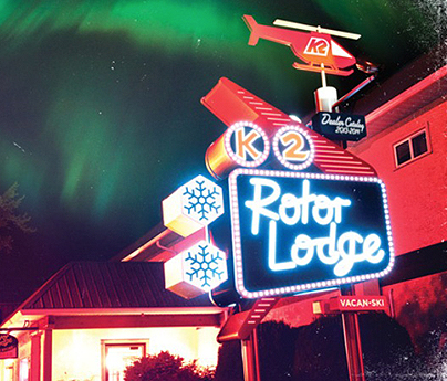
Digging through the archives, but here is a quick glimpse of a time we re-branded one of the CMH lodges as the K2 ROTOR LODGE for our catalog and corresponding theme.
MORE TO COME SOON.